Your First Data Science Project: From CSV to Graphs in Python
A Practical, Beginner-Friendly Guide to Turning Raw Data Into Insightful Visualizations
Starting your first data science project can feel overwhelming — there are tools to learn, libraries to install, and datasets that look like they were designed to confuse you. But don’t worry. Every data scientist begins exactly where you are right now.
In this article, you’ll build your first end-to-end data science workflow: reading a CSV file, cleaning data, performing simple analysis, and visualizing the results using Python. By the end, you will take a raw dataset and turn it into clear, meaningful graphs.
1. Understanding the Data Science Workflow
Whether you're analyzing sales numbers or exploring global climate data, the basic process remains the same:
This structured flow ensures that your analysis is reliable and repeatable.

2. Loading Your First CSV File
CSV (Comma-Separated Values) files are the most common format you'll encounter in data science. Python’s Pandas library makes reading them incredibly easy. Here's how you load a file:
This gives you a quick overview of column names, sample values, and data types.
3. Exploring the Dataset
Before you do anything else, it's important to inspect the dataset and understand what you're working with. Pandas provides several utilities to help you:
These functions help you identify missing entries, incorrect types, or suspicious values.
4. Cleaning the Data
No real-world dataset is perfect. You’ll often find missing values, duplicates, or unexpected text mixed with numbers. Cleaning the data is essential before performing analysis:
Even small corrections can dramatically improve analysis accuracy.

5. Performing Basic Analysis
Once your data is clean, you can extract meaningful insights. For example, suppose you want to analyze average monthly sales:
This quickly shows trends, helping you spot peaks and dips in performance.
6. Creating Visualizations with Matplotlib
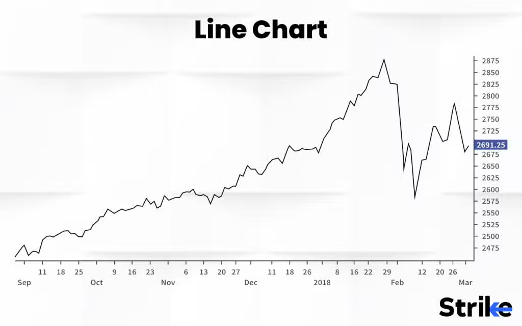
Data visualization turns raw numbers into easy-to-understand stories. Let’s create a simple line graph:
This produces a clear visual representation of monthly performance.

7. Creating Better Visuals with Seaborn
While Matplotlib is powerful, Seaborn offers more modern, elegant styling by default:
With just one line of code, you can produce polished bar charts, heatmaps, and more.
8. Wrapping Up Your First Project
Congratulations — you’ve just completed your first real data science project! You loaded data from a CSV, explored its structure, cleaned inconsistencies, analyzed key metrics, and visualized patterns using graphs.
These are the same foundational steps used by professional data scientists worldwide. As you progress, you’ll work with larger datasets, more complex models, and sophisticated visualizations — but the core process remains the same.
Keep practicing. Try different datasets. Experiment with new charts. Every dataset has a story to tell — and now you know how to uncover it.